This Thursday lunch time at Minitheory, we had a round table discussion on design details. Design details are the things that can make or break a product. Just as architect Mies famously quote, “God is in the details”, every aspect of his work, from overall concept to the smallest detail, supports his effort to express the modern age. Facebook design director Julie Zhuo wrote in her article “The Idea Person” that while people often like to fantasize about the “big ideas”, we should also celebrate the “Follow-Through Person” who “fights the devil in the details every single day”.
The following are some of most interesting design details that were discussed during the sharing session:
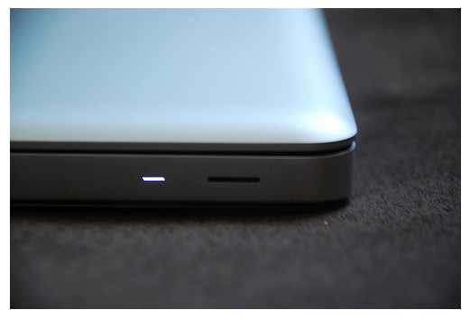
Mike: Macbook Pro sleep indicator
Mike talked about the design the sleep indicator on the older Macbook Pro models. The indicator light is hidden on the surface until it is light up. Most interestingly, Mike pointed out that Apple has a patent for the indicator light because the rhythm of the light turning on and off is set to the human breathing cycle as when we’re asleep.. The breathing effect makes the indicator feel relaxed and soothing.
Masha: Waze GPS App
Masha shared that she uses Waze for driving. The app remembers her daily routine drives and automatically suggests routes based on those. Also, the application recognizes that the user is going to work so user can just say “show me the way to work”, instead of typing out the name or address of the location.
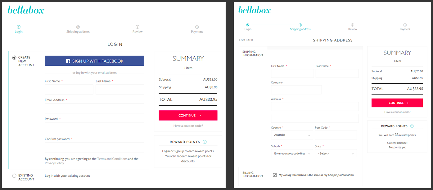
Charmaine: Clear interface copy details
Charmaine talked about a design detail in one of the previous client projects, bellabox. In the checkout flow for bellabox, it needs to be clear that users can earn rewards points by logging in or signing up. Concise and clear copy writing helps communicate this information successfully to the user.
Zavien: Smart underline
Zavien shared about smart underline and how it is different from common underlines. Smart underlines does not overlap with the main text, therefore it simplifies the visual complexity of the typography by reducing attention to itself. Medium is paying attention to this design detail and now Sketch also supports this feature.
Pizza: Facebook sound effect
Pizza talked about Facebook’s new funny sound effects for interactions on their mobile app. The funny sound effects change the character and feel of the app which is originally more serious in nature. The discussion extended to the interesting field of sound design and how to design for emotion by utilizing sound kits in interface designs.
To conclude, designers at Minitheory love design details. It is the kind of thing that’s often invisible to users but unconsciously makes the design friendlier and more usable. Attention to detail is a key characteristic of a good designer and the sharing session helped us to pay more attention to the details we may otherwise overlooked.


